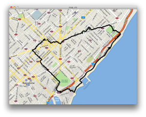
See: data workshop I wanted to get a feeling for the data so I started off by creating a quick and dirty Processing sketch that visualizes the location data recorded with AntiMap. I used Unfolding Maps, a very complete and well-made library for using maps inside Processing. Here is a screenshot.  That felt very static, and the core of my concept is how walking brings the city to life. I wanted to see how it would look like if I animated the trail, showing only a part of it. I also cleaned up the code a bit so it would be a bit easier to work with. This is the result:
Visualization of GPS data, iteration 1 from Bert Balcaen on Vimeo.
It draws a circle for each location. The circles grow and gradually become more transparent. It’s simple but interesting: it brings the data to life. Cristobal suggested to use the map colors for the trail. I really like that idea, so I thought that would be a good next step. Here’s a video:
Visualization of GPS data, iteration 2 from Bert Balcaen on Vimeo.
However, at the moment I’m stuck on how to pick the right colors. The Unfolding library uses the GLGraphics for drawing maps, making the whole thing fast by using OpenGL. It also makes some basic things more complicated. For example: it seems that the get() function to find a color’s pixel doesn’t work as it should. I think some sort of offset is applied.