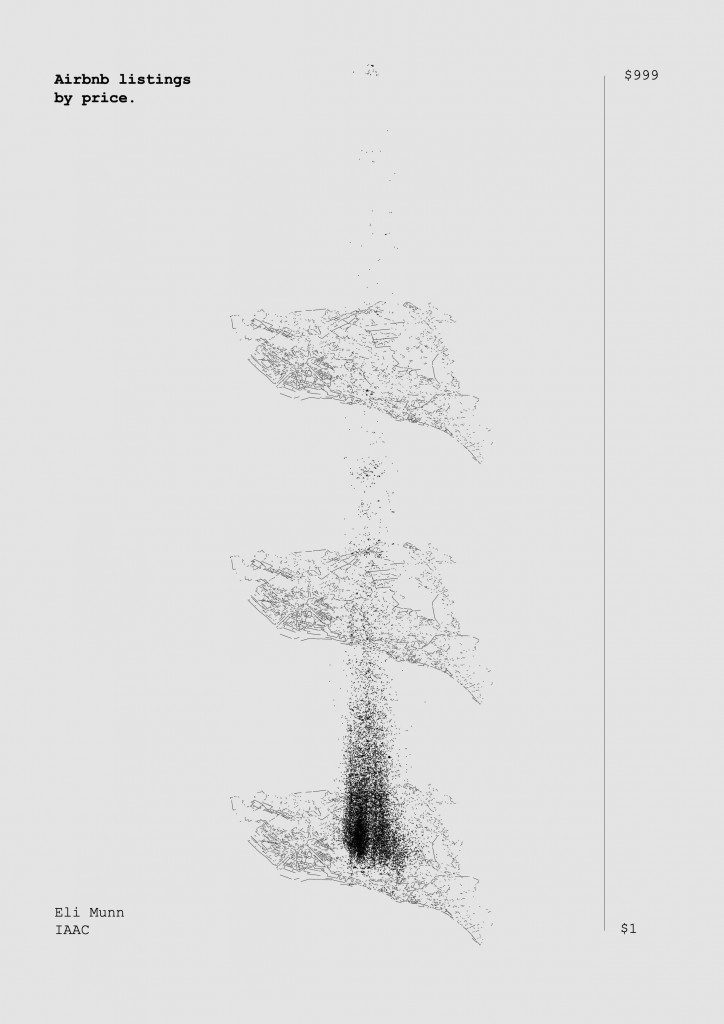
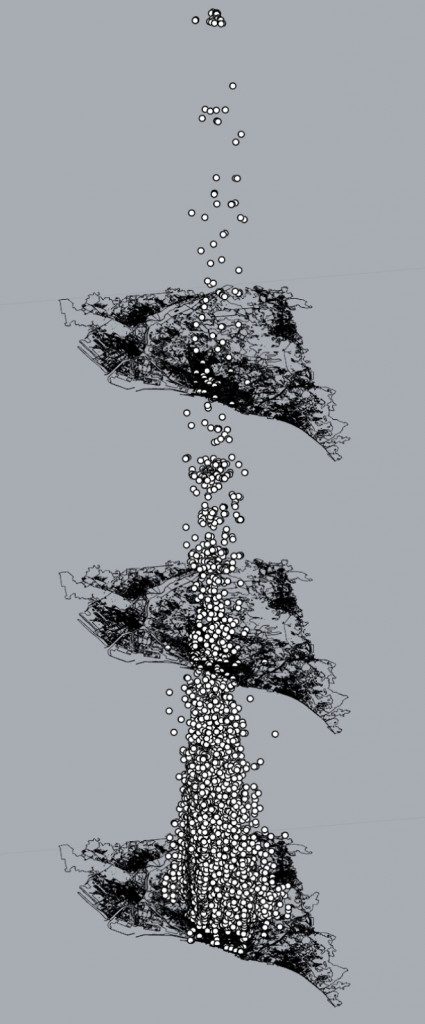
The goal of the City Data View project was to find a new ways of visualizing data pertaining to Barcelona. In my case, I wanted to examine the topic of Airbnb prices. 
I began with a Shapefile of Barcelona found at Carto BCN. This was imported into Rhino.
Fortunately, Airbnb makes much of its data public. I found a dataset 
The dataset showed listings in Barcelona along with information about each one. Some notable columns were: host response rate, reviews, summary.
The column I wanted to visualize was listing price. It seems that Airbnb set its own range of $1 – $999. To visualize this it made sense to use x and y axes to plot latitude and longitude and use the z-axis to plot price. 
Final touches were done in Illustrator to Achieve the first image.