//ABSTRACT:
The design manifesto is to propose a community space using timber, structurally optimised and performative, and acts as an open public plaza – an ‘urban agora’ on the street level with a facade designed according to the extreme continental climate. It also integrates climatic methods and strategies in form finding, natural lighting, self shading and reducing the heat gain. The building is designed as a multilevel gathering space, with social functions stacked vertically. the lower level is the recessed and sheltered semi-outdoor space.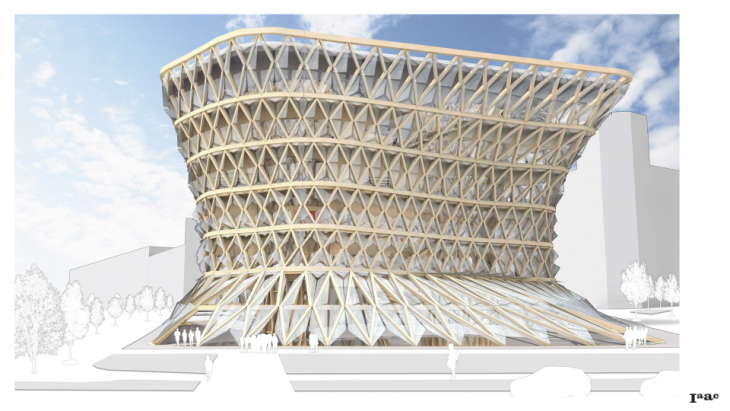
//PROJECT INTENT:
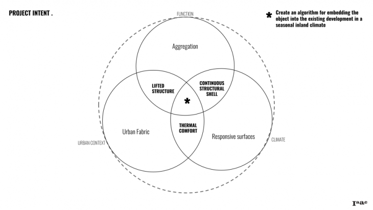
The city today is lacking the community space: the modern architecture has created a number of single-function venues which are often separated far from each other. Even the so-called multifunctional or mixed-use buildings are really mostly the retail centers with an entertainment component and they are usually located far from the residential areas.
//SITE ANALYSIS:
Moscow is located in the sharply continental climate zone, with the annual temperature difference over 50 C, cold winter, hot summer and frequent rains in the midseason. Altogether this calls for the sheltered public space. Another problem, specific to Moscow, is the deficit of the quality public space in the old residential areas in the historical center.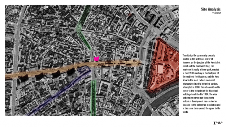
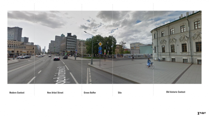 The park along the boulevards remains one of the favourite walking spaces but the square created by the crossing with the new street is empty and unused. The urban void on the corner is the footprint of the historical building demolished in 1994. The wide and straight street cut through the historical development has created an obstacle to the pedestrian circulation and at the same time opened the space to the winds. The plot area is about 2000 m.sq.
 The important feature of the local pedestrian circulation is that there are no connections between the boulevard and the next backstreet parallel to it, except the Vozdvizhenka street. The neighborhood features several landmark buildings.
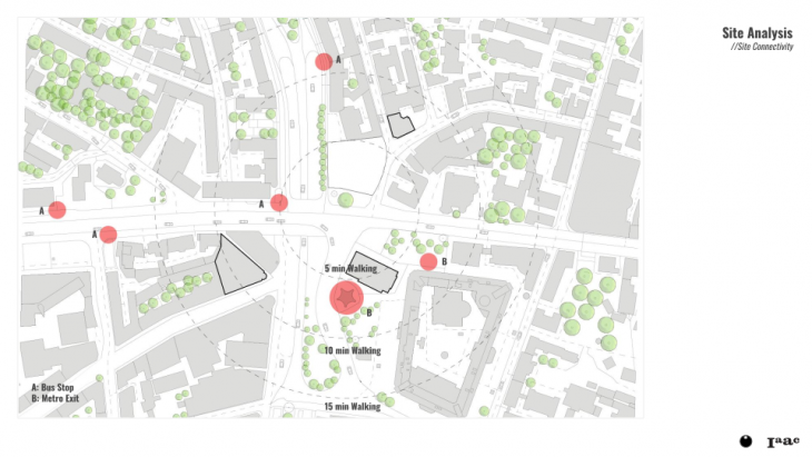 There is one of the key subway interchanges across the street and bus stops in the 2 minutes’ walk distance. Before the project site has become an endless construction spot, locals used to be cutting the angle through it and the facilitation of the pedestrian circulation is an important demand of the community.
//DESIGN OBJECTIVE:
The design objective is to create such a space – an all-year indoor destination which would offer the local community all the basic social services, a space for interaction, leisure and, possibly, work – provided that the modern telecommunications allow us to work everywhere. We estimate the need of space for the community center program as 5000-8000 m.sq. The requirements for this building would be: accessibility, transparency, friendliness, flexibility and adaptivity, climatic comfort all year round, sustainability.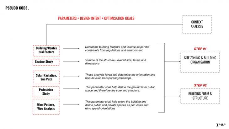

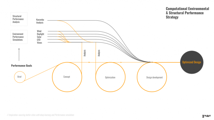
//ENVIRONMENTAL ANALYSIS:
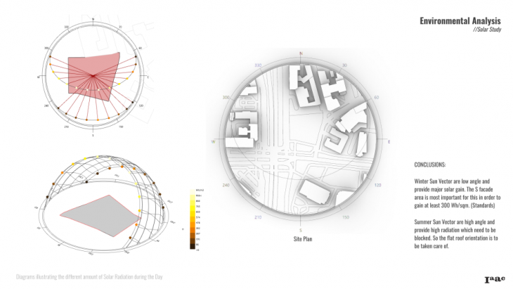
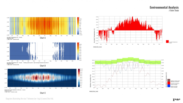 It is observed through the analysis that the daily temperature is maximum between June-August (30 Degrees max) and the lowest in December-February with average of 0 degree Celsius.
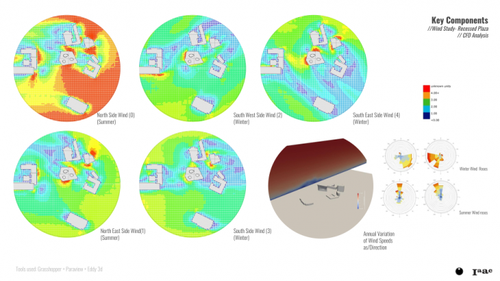
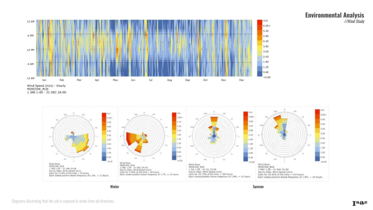 The wind analysis showed that site is open to winds from all directions and this is a serious issue in winter as well as summers. The prevailing winds in Moscow are South-West, to which the site is fully exposed.
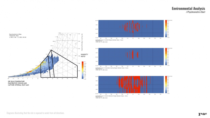 Passive solar heating and capturing heat gain are two major strategies that aid in improving the comfort by about 40% especially in the heating period. Other strategies like evaporative cooling helps by a small extent in the cooling period. These help in design to improve comfort percentage from average 4% to 45%.
//MASSING STUDY:

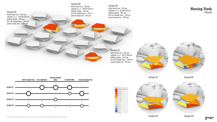 Based on our environmental studies, in order to find the form; we defined 4 major Fitness Objectives
- Reducing the Heat Loss in the building by Minimizing the North Façade
- Reduce Building shadows on the Surrounding buildings as per the bye laws.
- In order to create a shaded space for Pedestrians, Maximize the Ground Canopy
- and the 4th One maximize the Flat roof for creating the negative slope for self shading and also collecting the Rain Water.
//DESIGN ELEMENTS:
The three key components of our proposal are Light wells, Skin and Plaza.
Light Wells: After Initial Daylight studies, it was found that our “Variant 01” Volume, from Wallacei lacks Natural Light in the Center. In order to tackle this, we introduced 2 Light Wells in the Building.
Shading Skin: Concluding from the Climatic Analysis that Wind is a huge issue in Moscow, both in Summer and Winter period, we decided to wrap our building in a skin of structural timber.
An Important aspect of the proposal includes creating a Public plaza on the Ground and the Lower Level and extends its Canopy for protection from Rain and Snow.
After mapping the Pedestrian Movement around our site, we created a seamless Pedestrian movement crossing our site in diagonal motion and cutting the Urban plaza on Lower level into smaller parts.
//KEY COMPONENTS:
Hence to simplify the lower level and due to this unorthodox behaviour of wind in the climate of Moscow, it made most sense to us to close the timber frames using new innovative materials like textile (like in textile facades) that could not only protect from the wind but also help in cleaning the smog particles in the air since they have air filter for Nitrogen oxides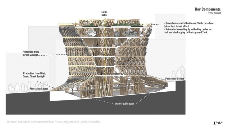 Our Proposal includes addressing the challenges of designing a building in the Cold as well as harsh summer climate of Moscow protecting from Direct Sunlight and Glare by timber screens that can be Operated as per need. Also by Creating Vegetation both on Lower level as well as Upper Level with Deciduous Plants we aim to reduce the heat gain in summers and contribute in solving issues like Urban Heat Island effect in the city of Moscow.
//STRUCTURAL OPTIMISATION:
To optimise the structure, it was necessary to define the homogeneity vs heterogeneity – which part distributes the load dominantly or is it equally distributed. Since it is a public space, Hence, the intent was to make the floors lightweight and a continuous shell, thereby making the cores and the facade the major structural system.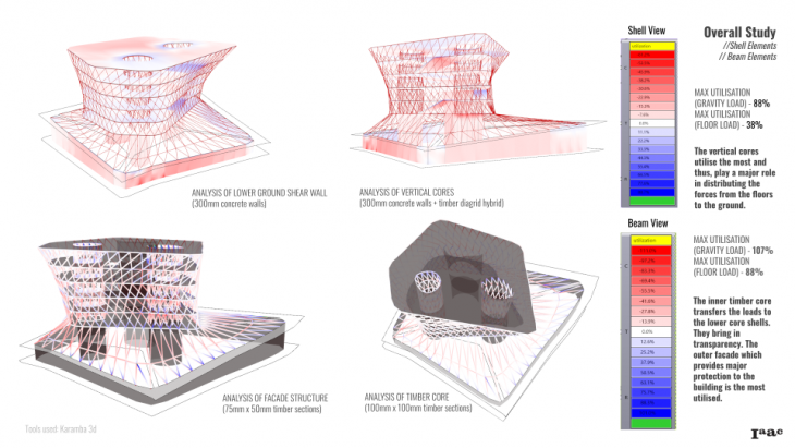 Thus, it was crucial to understand how different elements of the structure work. It is good to know that the floor load doesnt affect the cores as much as the gravity load. And the shear wall aids majorly in relieving stress from the cores. The diagrid timber beam elements on the facade and the light wells work much harder to support the overall structure due to all vertical loadings. These studies help us to understand the effective of the timber concrete hybrid over the predominantly concrete structure.
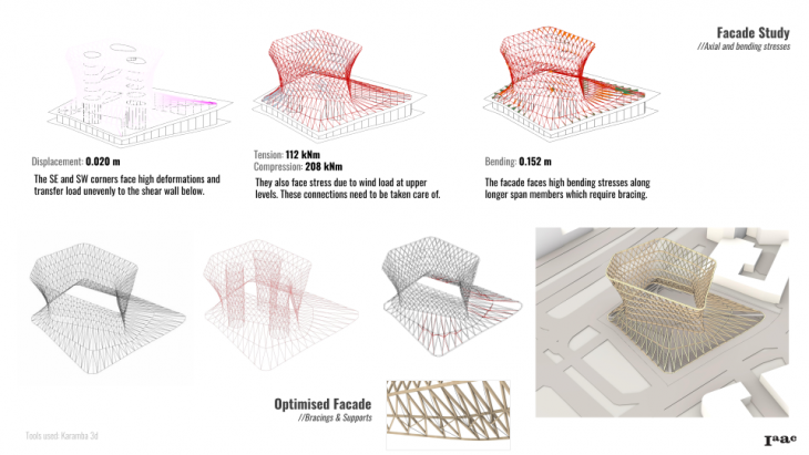
The facade study shows deformation, axial and bending forces were taken into account. it was noticed that it faced high deformations along longer spans, high tension and compression along major wind load directions and bending due to inadequate support in some locations. so, in order for forces to be transferred evenly to the shear wall below from the facade, it required some additional bracing elements.
//PROGRAM:
The building is designed as the new agora, the multilevel gathering space, with multiple social functions stacked vertically. the lower level is the recessed and sheltered semi-outdoor space. it is open from all sides and not artificially heated or cooled but the projection of the building’s skirt canopy protects it from the elements and creates a more comfortable microclimate.
From the street level one may climb up the continuous wide open stair combined with the series of amphitheatres which runs along the facade through all floors up to the roof, or to take the elevator directly to the destination floor.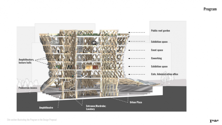 The spiral stair/amphitheater space defines the figure to ground relation as uninterrupted: one may take a continuous walk up and down through the building, the floors becoming the stations placed on the different levels along this journey.
//CONCLUSION:
Each floor of the building is designed as the open space around vertical voids. The spiral amphitheatres which go around the cores along the outer perimeter and the dynamic shape of the wall and the cores are the key players in the drama of spaces and surfaces.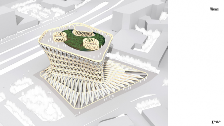 The pedestrian routes dive under the skirt canopy into the recessed plaza of the lower level and climb up along the spiral amphitheatres which go around the cores along the outer perimeter.
 The voids deliver the daylight to the middle of the building, which is quite deep. the floor space is wrapped into the skin, which is at the same time the bearing wall, the opening for the daylight and the protection from the sun radiance – depending on the season, time and weather conditions.
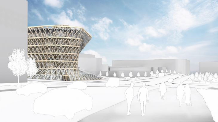 As it usually happens, the well-grounded solutions work well in many senses: the sophisticated shape of the building, created through the environmental optimisation procedures, adds value to the site by opening the views at the landmark buildings around.
//CREDITS:
Optimised and Performative ‘URBAN AGORA’ is a project of IAAC, Institute for Advanced Architecture of Catalonia developed at Master in Advanced Computation for Architecture & Design in 2020/21 by students: Nataliya Voinova, Harsh Shah and Sachin Dabas lead faculty: Rodrigo Aguirre faculty assistant: Oana Taut


