From Tactile Atoms to Digital Data Visualization
come with the good initial inquiry
it has to respond to the purpose of the research and the way it will be implemented in the design process
Introduction
“Digital Tools & Big Data” seminar accompanied us throughout the year and its support has been fundamental for the development of each project.
In this work, we would review the journey of individuals with different backgrounds (Architecture, Urban Planning, Information Technology, Interaction Design, and Political Science) who aimed to learn and integrate digital tools into their work.
Part 1
Chapter 0 / Precourse: Preparing Future Data Scientists and Urban Technologists
During the pre-course, we had the opportunity to start familiarising ourselves with the pillars of programming: variables, loops, data types, object-oriented programming and concepts, functions, methods, and data interactions among others. A very challenging experience, especially for those students that were not coming from Computer Science or did not have a consolidated technical background.
Chapter 1 / Big Data and Digital Tools I: Spatio-Temporal Data and Their Management
In the first part of the program, we learned how to use the Pandas library to prepare and manage the data, produce analysis and visualize results. Throughout the course, we also integrated and managed other libraries such as Geopandas, Numpy, Shapely, etc.
The content of the course includes data frames, geo data visualization, DEM/DTM raster data model, customizing plot, geo data visualization, numeric analysis, extracting features.
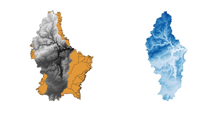
Luxembourg Middle segment Elevation (Side by side on Vector Layer)
Chapter 2 / Big Data and Digital Tools II: Big Data Analysis
The second part of the course required a deeper understanding of data management and data visualization tools. In this part, we learned about Consent, Seaborn, Pandas, data frames, Line plots, bar charts, multiple charts, Facet Grid, data scraping, Python animations, Matplotlib animation, and animation manipulation amongst many others.
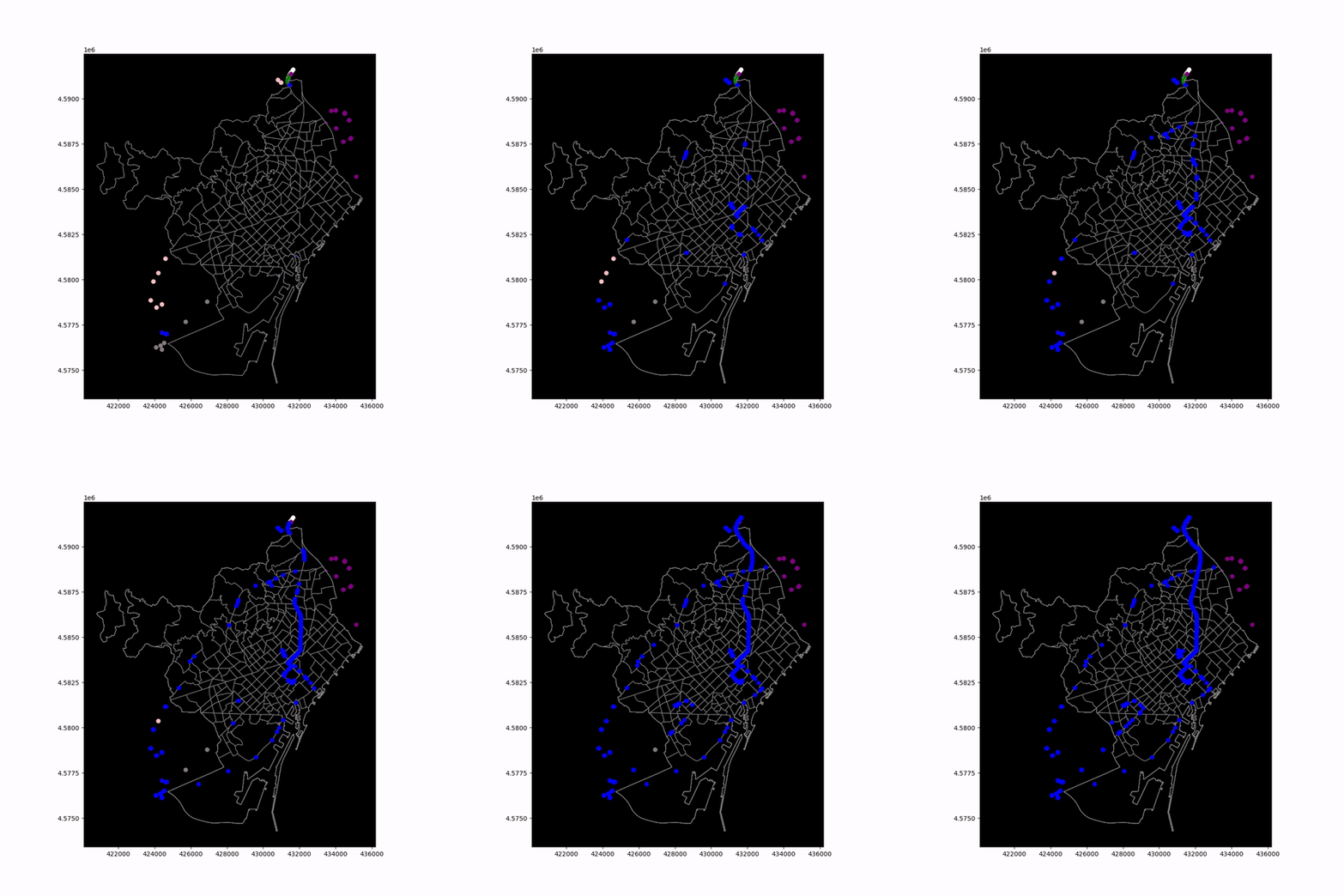
GPS for Urban Goods Distribution for 20 Devices
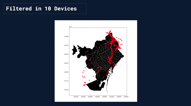
Using Base map with projected GPS locations
Chapter 3 / Big Data and Digital Tools III: Flow Data and Trajectories
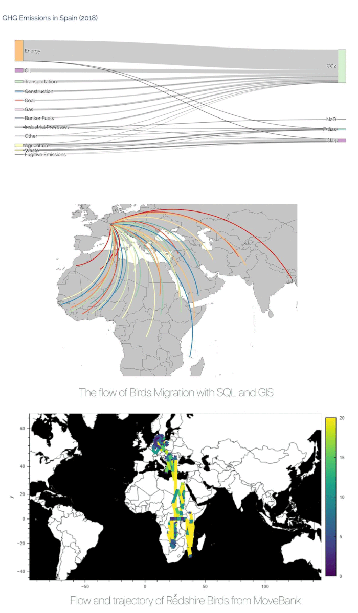
The third installment of the course was about flow data. This type of data describes variables that may move from one place to another. We discovered different tools to explain and present this kind of data and for example, Sankey diagrams could be a powerful and effective tool for this purpose. We used data visualizations to analyze movements and changes in the value of particular variables.
Part 2
Environmental Data as Common Analysis Field
During our studies in this master, a file-rouge connected many of our works. Several of our projects had to do with the environment, from experiences of rewilding, renaturing, and carbon capture to the proposal of a methodology for the adaptation of the urban infrastructure, facing the continuous challenges of climate change, passing through the analysis of people’s behavior in relation to green infrastructure.
Studying the relationship between man and the environment is a very complex topic, especially because the challenges in this field are many and finding a solution is not so easy. They include the most important ones such as climate change, pollution, energy transition and renewables, sustainable food models, protection of biodiversity, sustainable urban development and mobility, hydric stress and water scarcity, extreme meteorological phenomena, overpopulation, and waste management to name a few [1].
This is an issue which, as future urban technologists, concerns us closely. Recently, there has been increasing talk of nature-based solutions to solve issues in the urban environment, but as expected these challenges are the most important not only for urban development but in many other disciplines. Scientists from different fields are required to analyze environmental challenges, simulating different scenarios, creating proposals regarding the issues, and evaluating the results. For doing so, very often accurate datasets are needed and their quality is crucial to address the right decisions and offer the best solutions.
Availability of Environmental Data and Datasets
The general and widespread interest in this kind of data makes them so precious and very hard to find. The necessity of open data related to this important topic is quite obvious, but unfortunately, it is something that still finds some obstruction.
During the course, we discovered many sources to overcome this problem, and the most used and relevant for our purposes regarded satellite imagery and tools such as Digital Elevation Models (DEM). DEMs are obtained through Light Detection Satellites (LiDar). This method determines different ranges in height values, using a laser to target an object and measuring the time that the light takes to reach the object and is reflected by the object itself, to determine its dimensions.
Another type of useful data for our purposes and analyses regards indexes such as NDVI (Normalized Vegetation Index) NDMI (Normalised Difference Moisture Index) and NDWI (Normalized Difference Water Index) amongst many others. Their utility lies in providing us with information about the health of the subjects analyzed.
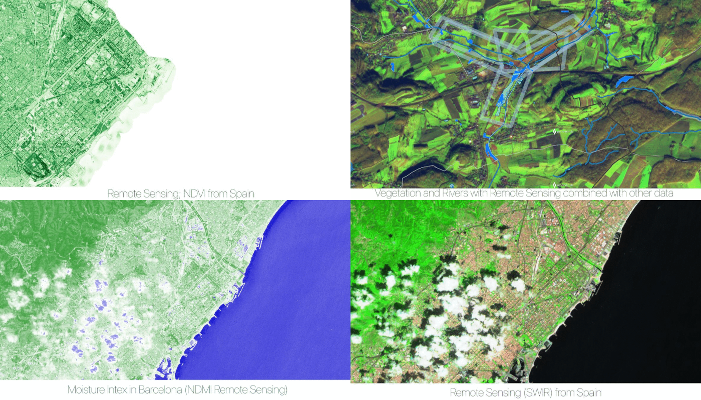
We had the possibility to also test other tools such as Open Computer Vision and Deep Learning in other seminars, but this was possible especially because in the meantime we were able to improve our skills in structuring, cleaning, and formatting different kinds of datasets into usable forms. An essential step to use them properly and also for a better understanding and visualization of data. For example, we used a camera as a sensor to detect people and objects in the street, in order to analyze the spatial relationships between people and the green infrastructure, analyzing movement patterns through the analysis of videos, processed through algorithms like YOLO [2].

Data Visualization (it has to respond to the purpose of the research and the way it will be implemented in the design process)
The correct visualization of data is fundamental to their understanding and each type of visualization meets different requirements, so it is up to the data analyst to choose the most appropriate one for the case. Seaborn, Matplotlib, GeoPandas, Shapely, and MovingPandas are just a few examples of the main Python libraries that can help us to plot and communicate in the best way the results of our analysis. Tools like QGIS and ArcGIS were useful to gather information from and manipulate different formats of files, like example shapefiles or GeoJSON files. While other tools such as Kepler or MapBox proved to be very powerful for the visualization, but only with an appropriate data cleaning and structuring process, in Python, possible especially thanks to the skills developed during the year.
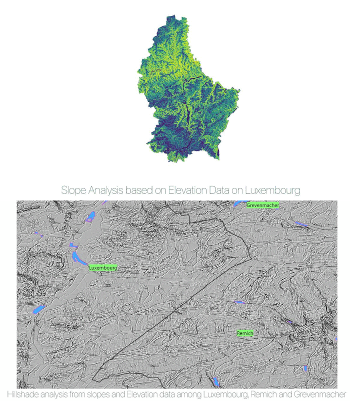
The choice of the proper visualization is based on multiple factors. Firstly because it has to respond to the purpose of the research and the way it will be implemented in the design process. Graphic solutions and consistency are essential to convey an unambiguous message. The proper usage of the same theme, colors, scale, and alignments is not only a matter of aesthetics, but it is fundamental in terms of clarity.
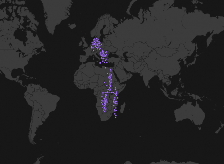
Redshire Bird data from Movebank projected with Mapbox enbaled Kepler
An example of the power of using data is represented by the collection of data from different animals, attaching sensors or different types of remote sensing devices to them, in order to better understand their behavior. In fact, in the example below, we visualize the movement of the red-shrike bird, retrieved from Movebank, a free, online database of animal tracking data (Max Planck Institute of Animal Behavior) [3].
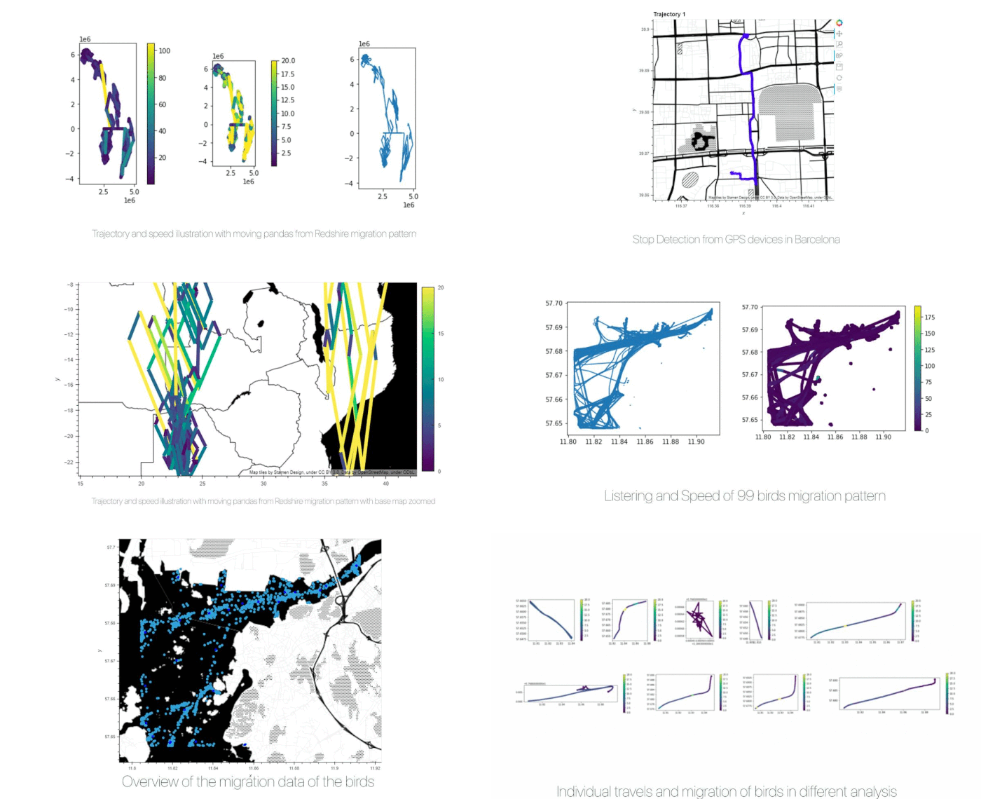
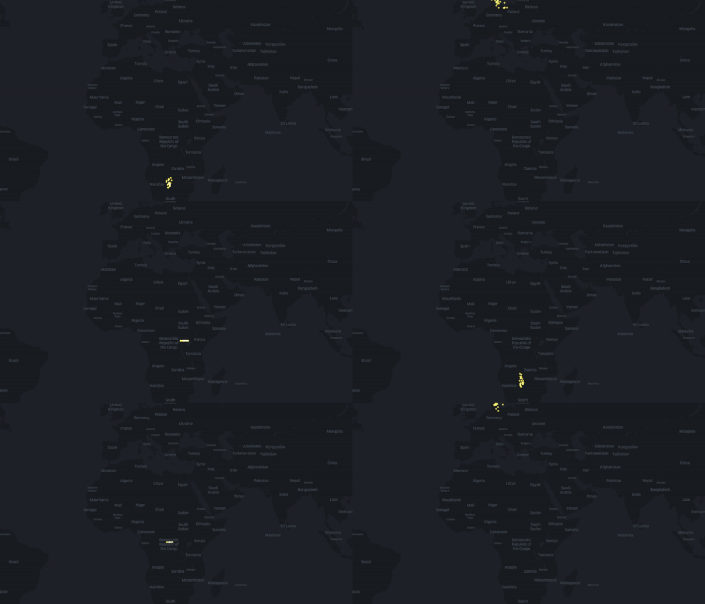
Movement of Redshire illustrated on Kepler
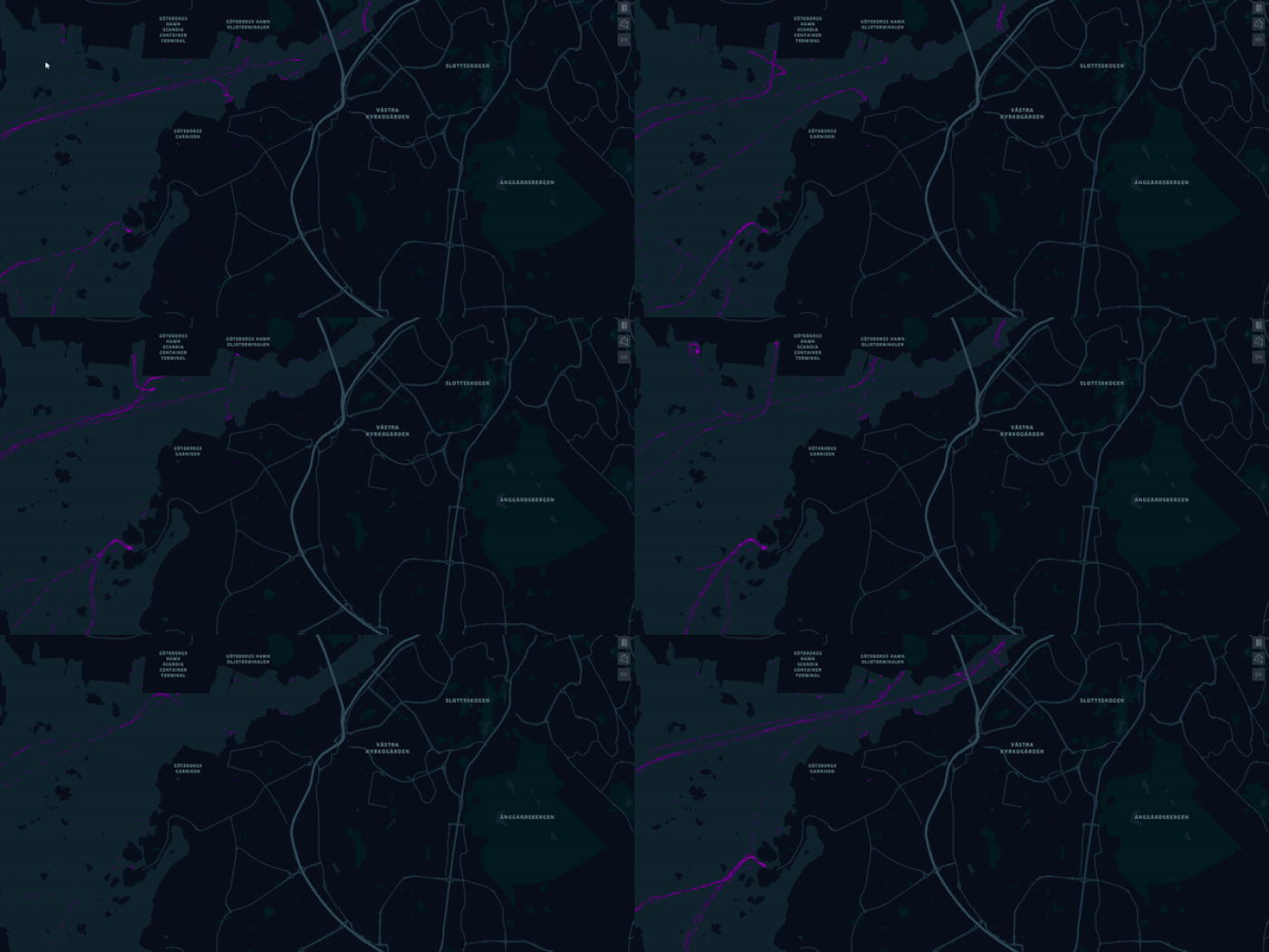
Bird migration trajectory animation
Conclusion (come with good initial inquiry)
In a nutshell as a data scientist or urban technologist, you always need to come with a good initial inquiry. Why are you looking for something? Why are you designing something? Other times you need to go back to see the importance and impact of the challenge you want to solve. In other cases, the people in a challenge with the problem that you are solving for them then start with HOW, might be interesting in this stage to see the previous generation how they have done something, but before you need to divide the specific tasks, gather tools and data you need and decide how to visualize them.
References
https://www.iberdrola.com/environment/most-important-environmental-issues
https://github.com/ultralytics/yolov5
https://www.movebank.org/cms/movebank-main
https://anitagraser.github.io/movingpandas/
From Tactile Atoms to Digital Data Visualization is a project of IAAC, Institute for Advanced Architecture of Catalonia developed at Master in City & Technology in 2020/21 by students: Sasan Bahrami, Mario Gonzalez, Matteo Murat, Ivan Reyes Cano, Miguel Angel Tinoco Hernandez, and faculty: Diego Pajarito.