What is Parkhouse?
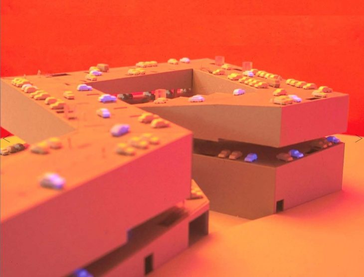
Parkhouse was a competition entry by Dutch firm NL Architects in 1995 for a mixed-use building in the center of Amsterdam, Netherlands. The striking feature of this building is that it is only 1/3 parking yet it’s form is completely shaped by the design for the vehicle. Our task was to place the project in it’s context of the 1990’s, understand the forces that shaped this project and the impact of the project afterwards. We decided to look through the years 1984-2005.

Courtesy of NLArchitects.nl
Our analysis started from understanding the perspective of the architect. We dug into their presentation from 1995 and found they highlighted notions of the city vs the suburbs, peripheries and perimeters and concentration vs dispersal but we believe that NL Architects had far more concrete concerns that were far more reflective of the discourse in the 1990s:
- Can parking spaces be made beautiful?
- Can we get away from obligatory design of parking garages?
- Is there a way to escape the repetitive floors?
- Can we imagine more exciting spatial configurations?
- Parkhouse: a new typology?

Courtesy of NLArchitects.nl
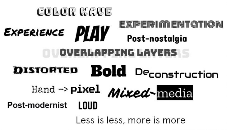
We identified three major concerns: Image, breaking out of tradition and experience. On this basis we created cloud of words that we felt related to Parkhouse and could be a starting point for our timefield analysis.

The 90’s was the advent of the personal computer and with it, an explosion of hyper-experimentation in all fields. Creatives all over were moving from hand to the pixel and this crossing over led to an incredible level of playfulness. The concept that was central to this time period and that summarises all this exploration is simply: Playfulness! Playfulness runs throughout NL Architects’ work and for this reason we believe that humour and wit are central to their design process.

Courtesy of NLArchitects.nl
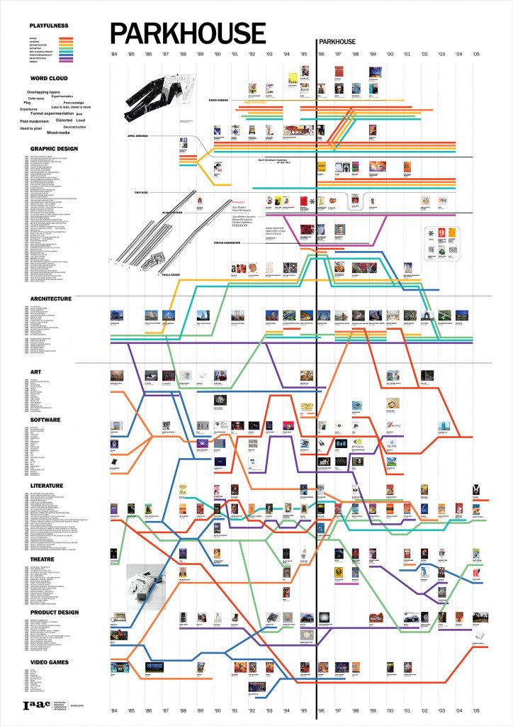
We decided to research the fields of of graphic design, architecture, art, software, literature, theatre, product design and video games to identify how playfulness and its components were involved in the forces that shaped Parkhouse.

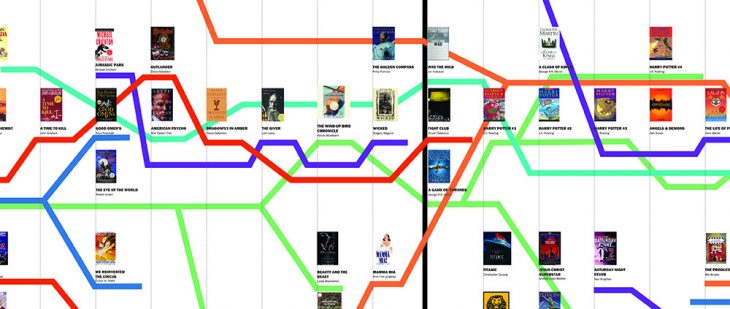
Our time-field is a horizontal chronological map from 1984-2005 that plots data points across the fields of graphic design, architecture, art, software, literature, theatre, product design and video games with Parkhouse located in the center line. Coloured streams representing themes of mixing, layering, deconstruction, distortion, non-classical beauty, three-dimensionality, objectification and whimsy connect all the points together and show how Parkhouse was a symbolic of the 1990s.
Visually, we wanted the map to capture the vibrancy of the 1990s through typography, color, layers and collage-like use of images to illustrate the data points. We also wanted to capture the spirit of Parkhouse by referencing the transportation maps of Massimo Vignelli, through the use of colored strips as homage to the parking strip diagram and through the crossing and overlapping paths echoing the geometry of Parkhouse.
Conclusions
Parkhouse is remarkable in that it was conceived in 1995, the year that Windows ’95 was launched, and only a few years after Autodesk’s Autocad was launched meaning that it was on the forefront of technological exploration. Parkhouse is a conformative building par excellence in that it mixes building types and is formal in gesture. Technology has allowed and continues to allow creatives, scientists and innovators in all fields to create and dream in dimensions that were previously not possible.
Timefield – Parkhouse is a project of IaaC, Institute for Advanced Architecture of Catalonia developed at the Master in Advanced Architecture in 2019 by:
Students: Rani Kamel, Michele d’Eglise, Frank Feng, Harsh Vora, Andrea de Stasio, Roshin Anthoora Valappil
Faculty: Manuel Gausa, Jordi Vivaldi Piera
Assistants: Mohamad Elatab, Firas Saffiedine
