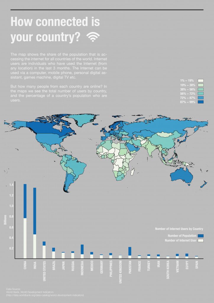
The number of people using the internet has surged over the past year, with more than one million people coming online for the first time each day. As of 2019, there are 4.39 billion internet users connected to the world wide web. These facts led to the curiosity to find out the landscape of internet connectivity in our world today. The bar plot shows the top 20 countries with the highest population and then evaluate in three key ways:
1. How many of each country’s citizens are on the Internet
2. What percentage that number is of their total population
3. What percentage of the Internet’s total population is from each country
How does your country compare to others?

The visualization is made by comparing the data of the total population figures gathered by UN World Population Prospects (2017), and the number of Internet Users per Country that is published by The World Bank. By means of matplotlib and numpy, a bar plot is then created to visualize how much of internet user does each country have, to give an idea of its internet development within the country. Using the same dataset (.csv), a world map is created by processing the attribute table on QGIS to show the most country that has internet user globally.
Through mapping visualization, we can see the geographic and economic disparities in which country has the most of its population is connected to the internet. From the GIS map, we can see that although China has the most internet user in the world, it doesn’t mean that China has the most internet penetration if measured by country.
Dataset: The World Bank Data, Humanitarian Data Exchange, SimpleMaps.(
http://data.worldbank.org/data-catalog/world-development-indicators)
Other References: World Bank, World Development Indicators & UN World Population Prospects (2017)
Worldwide Internet Users is a project of IaaC, Institute for Advanced Architecture of Catalonia
developed at Master in City & Technology in (2019/2020) by:
Student: Aryo Dhaneswara
Faculties: Diego Pajarito